Saturday 21 December 2013

Contact Sheet - Photoshoot 08.12.13


Above is a contact sheet of the photos taken on 08 December 2013 of my cover band. In these photos, I wanted to capture the essence of music video screengrabs and promotional material for promoting their album "The Jungle". The shots of the band, taken in front of the tree, works well with the album title.
Furthermore, the naturalistic setting will provide a stereotypical indie quality to the magazine, because indie artists are frequently claiming to be less about the music industry and more about the music itself and 'going back to their roots'.

Contact Sheet - Studio Shoot


Above is a contact sheet of the photos taken on 10th December 2013 during my studio photoshoot. In this, I took photos of 3 contents page models, before going on to take pictures of my cover band.
I brought an acoustic guitar for the band, as this has strong connotations of the indie genre. Also, a pair of drumsticks were used to show the drummer of the band, as the idea of the band members playing instruments and making the music themselves adheres to the stereotypes of the genre.
Furthermore, I chose not to use a microphone, as I felt that this would too literally represent the band's vocalists, particularly as the indie genre tends to naturalistically represent their artists. A microphone would have sensationalized the band too much. 

Tuesday 10 December 2013

Production Log - Thoughts on Second Photoshoot

On Sunday, I did my second photoshoot. For this, I had all members of my band, and I shot them in the same location as my previous photoshoot. I wanted this to be a continuation of the photos I previously took, so I had 2 of my models wear the same costume as before, so that all of the photos were valid.
Looking at the collection of pictures I took, I decided that they would be most effective as an album cover and screen grabs from the band's music video. Creating an album cover and suggesting that some of the pictures are screen grabs from their music video will add to the realism of the magazine, as artists featured in magazines tend to be successful enough to have both of these things.

Monday 2 December 2013

Location Ideas

Location Photoshoot 1 - Contact Sheet - 01.12.13


On the 1st December 2013 I did my first photoshoot. Unfortunately, I was only able to use two of the models from my band. However, this meant that I could focus on taking solo shots of each of them and a few two shots.
For the female's costume, I used a floaty white dress with neutral toned brown tights and bohemian style brown ankle boots. I experimented with using a headband in some of the photos, as this has connotations of festival style. The style as a whole encasualated a bohemian style, which links well to the laid back style of the genre.
Continuing this 'laid back' theme, my male model wore jeans and a casual red check shirt. These clothes are fairly 'normal', as you could expect to see any man wearing this as an everyday outfit. Therefore, using the Uses and Gratifications Theory, this provides the audience with a means to identify with the cover star, as they could see themselves wearing the clothes.

Sunday 1 December 2013

Production Log 01/12/2013 - Change to Photoshoot Plans

Today I planned to take pictures of my band, but due to unfortunate circumstances I was only able to take pictures of two members. This gives me some images that I can use on my double page spread. I also intend to take some pictures of my band in other locations and take some studio shots. This is when I will get some solo pictures of the other two band members.

Tuesday 26 November 2013

Headlines & Pull Quotes

Below is a link to a presentation of Pull Quotes & Headlines.
Pull Quotes & Headlines

Model Release Forms


Here are copies of my model release forms. These prove that all four of my models agreed to participate in my photoshoots and that they allow me to use the images I take of them in my magazine. This means that I am able to select, edit and use images of them without further consent.

Production Log - 26/22/2013 - Deciding on Names

For my draft article, I needed to consider names for the band members of "Tigerilla", my cover stars.
I have decided on Damon, Dawn, Caleb and Max.

Sunday 24 November 2013

Production Log 24/11/2013 - Using New Media

In the past week, I have been considering how I would use new media for my music magazine.
I have created both Facebook and Twitter pages. I would also have an Instagram feed and a Youtube channel. These functions need to be clearly advertised in the magazine, along with QR codes etc. To target my magazine at a young target audience, new media is incredibly important to the success of my magazine, as these social networks are used extensively by 18-25 year olds, particularly as they can access it 'on-the-go' in the form of apps.

Monday 18 November 2013

Image Ideas

Production Log 18/11/2013 - Considering Image Styles

Over the past week, I have been considering what type of images I would like to take (while completing a selection of image ideas). I will use a combination of both studio and location shots, as this will follow the typical conventions of music magazines - that use a variety of images. I will also need various other artists to feature on my contents page.
From magazine research, I have noticed that front covers always include a studio shot of their cover star, therefore I will use a studio shot of my band 'Tigerilla' for my cover.
My contents page shall include a variety of both location and studio shots to portray the variety of my magazine. 
Finally, in my double page spread I am hoping to include a variety of location shots (one double page spread containing a full bleed image). One idea I had was to take pictures of my band 'behind the scenes' (possibly pictures from Instagram), as this follows the conventions of the genre, being laid back and more 'real'.

Wednesday 13 November 2013

Production Log 13/11/2013 - Final Masthead & Band Name

Following creating a selection of masthead designs, I have now decided what my masthead will look like.


The masthead works because it is fairly simple, which will give my magazine a minimalist appearance. This will appeal to my target audience, who are fans of indie music because it conforms to the style of the genre. The simplistic look will match the idea behind their costumes (doesn't look like it has been 'styled' or too fancy).


I have also decided on a name for my cover stars. The band will be called 'Tigerilla'. Many indie bands reference animals (or similar) in their name (e.g. Arctic Monkeys, Gorillaz, Of Monsters & Men etc.). Therefore, using a combination of the animals 'tiger' and 'gorilla' will fit into the genre of music well.

Tuesday 12 November 2013

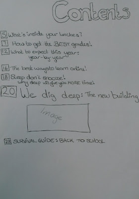
Preliminary Task Sketches

Below are my design sketches for my preliminary task. In these, I aimed to get a clear picture of what layout the front cover and contents page would have. This would make it much easier when transferring my ideas onto InDesign, because I would have a better idea of how to proportion everthing so that it fits on the page.

Monday 11 November 2013

Sell Lines

Feature Article:
  • Tigerilla Lash Out
  • Tigerilla: A New Breed of Band
  • You've Never Met a Band Like Tigerilla
  • Evolution Starts with Tigerilla
  • Join the Revolution: Tigerilla.
  • It's a Tigerilla Revolution

Artist/Band Based:
  • The Band Who Conquered The World
  • The Artist Whose Hair Made Him Famous
  • The Guy Who Threw Up at a Gig
  • The Girl Who Plays Bass
  • The Band Whose Song Got Banned
  • The Band Whose New Album Is Awesome

Other:
  • 10 Ways To Wear A Beanie
  • 20 Most Heartbreaking Songs
  • 30 Songs You've Never Heard Of
  • 10 Songs You've Heard Before but Don't Know The Name Of
  • Soundtrack: The songs featured on TV this week (TV Drama)
  • 5 Festival Moments We'll Never Forget

Contents Ideas


Sunday 10 November 2013

Masthead Design

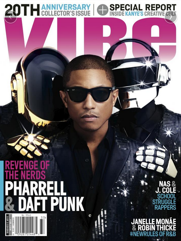
All of the mastheads are merely the magazine name Indievisual in 2D font. This follows the conventions of current magazine mastheads (Vibe, Mixmag, Q), keeping my magazine looking current and therefore appealing to my target audience. Furthermore, the colour of the masthead can adapt to the colour scheme of each front cover (as is done with Vibe, Mixmag and, until recently, NME).

1 - This is the masthead design I have chosen to use for my magazine. The sans serif font is easily readable and follows the current conventions of a magazine masthead. The masthead is bold, therefore making the name easily readable.
2 - I like this font, however, I think the font is too thin to stand out as a masthead. I like the slightly skewed 'e', as this gives the font a slight uniqueness. Therefore, I will consider using this within my magazine.
3 - This masthead is quite similar to masthead 1, but the lettering isn't as smooth. Therefore it lacks the modern feel of masthead 1. It is important for my magazine to have a new, modern feel because I have a young target audience.
4 - I decided against this masthead as I feel that it looks quite similar to the font used for the brand 'L'oreal'. Also, I think the capitals put unusual emphasis on the wrong part of the name.
5 - This masthead has an art deco appearance which I think my target audience would not respond to.
6 - Again similar to masthead 1, this masthead is bold and would stand out at the top of the front cover. However, I feel the text is too large and slightly too rounded to convey the new, young appearance of the magazine.
7 - Out of the similar mastheads (2,4,7) I think that 7 would probably make the most effective masthead. However, I think 1 would still be a better, easily readable and adaptable masthead.

Props & Costume Ideas


Saturday 9 November 2013

Production Log 09/11/2013 - Observation


In HMV, I noticed that several of the big (and small) posters to buy were Rolling Stones front covers. This shows not only that the brand is 'cool', but that the cover stars are vital to the success of the magazine. 
If the pictures of the celebrities are strong enough to be released as posters, the cover will essentially sell the magazine when it's in stores and make the reader pick up your magazine over another.

I really like the idea of front covers being made into posters and this is something I will consider for my magazine.

Tuesday 5 November 2013

Production Log - 05/11/2013 - Attending an Editors Talk

Yesterday, I attended the Hearst Editors Talk at the Millenium Hotel in London.

The talk featured four Editor's, and these were:

Victoria White - Editor, Company Magazine
Mandie Gower - Editor, Zest Magazine
Sarah Bailey - Editor-in-Chief, Red Magazine
Louise Court - Editor-in-Chief, Cosmopolitan
David Moynihan - Editor, Digital Spy (Editor of NME until March 2011)

The talk covered lots of aspects of magazine production, though I found there was a resounding message about how it has changed so much, in such a short space of time.
It seems that new media is vital to anyone in the industry now. Even the editors' personal Twitter accounts have to be carefully thought out (The Company editor feels that posting about her children will use their younger target audience. The Cosmo Editor-in-Chief has been told that she posts too much about the sports team she supports).

Another thing that I felt was important was the mention of "Brand Pillars". I think it's important for my magazine to have Brand Pillars, therefore, I will be considering what these will be.

Saturday 2 November 2013

Proposal Feedback

This highly detailed proposal works well to propose the ideas behind the magazine, to me as a potential buyer. The explanation beind the name leaves me convinced that it could sell to audiences based upon the name alone, as indivisual is a clever play on words that automatically tells an audience member that the writers are clever, funny and related to your favourite Indie genre.

The description of your target audience is detailed, and means that when describing your magazine, it is clearly stating who your target audience is, and then describes your secondary target audience and why they would support the genre.

What you appear to be missing in this proposal however is a quick description of how you will entice your target audience (based upon their gender specifically), and then the same thing with your secondary audeince. This is important as more detail will lead to a more successful proposal.
 
 
Feedback Courtesy of Oscar Perillo

Audience Profile

Primary Target Audience - Male 18-25 - Mainstreamers
Callum is a 23 year old who recently returned home after a year travelling around Europe. He thoroughly enjoys discovering new things, new cultures and can't wait to explore another part of the world.
He likes music because he likes it. He shouldn't and doesn't really have an explanation why. He owns an acoustic guitar and knows a few chords that he's picked up over the years. Sure, he's not going to be the next Ed Sheeran, but he likes the sound.

Callum never goes anywhere without his beanie - half the time it hides his messy hair (the red dye is still a bit visible, despite his numerous attempts trying to wash it out - he thought he'd try out the new trend).
He also loves his coffee - Starbucks, Costa, Caffe Nero (although Starbucks is his favourite). He's become a regular at his local, and they recognize him now, sitting there with his laptop, his android tablet (reading the latest issue of IndieVisual) or listening to music (through his bright red UrbanEars headphones).

Callum loves the city but, though he likes meeting his mates at a bar or pub for a drink or two, he also likes his own space (to play his guitar or listen to music or just chill). He likes to think he has an artistic side - his Instagram is full of photos and his Twitter is updated with every deep thought that enters his head.

The problem is, Callum kind of hates his job. Luckily, Callum has IndieVisual magazine to keep him preoccupied when things get too boring (though he swears he only reads it during his lunch break). He likes reading about Kings of Leon's life on the road and wants to know whether it's worth downloading Snow Patrol's new album. He's also really hoping to win tickets to Ed Sheeran's next gig at Camden Roundhouse.


Secondary Target Audience - Males & Females 16-30 - Mainstreamers

Friday 1 November 2013

Proposal

The magazine I propose to create is IndieVisual, of the Indie-Pop genre. I aim to provide readers with a visual companion to their favourite music, and open up their eyes to the world behind the music.

Indie-Pop would seem like an odd combination to start off with. However, as indie music is becoming more and more popular within the mainstream market, I want to create a magazine that targets this psychographic market (mainstreamers).
One of the reasons why IndieVisual is such an apt name for the magazine is that my target audience tend to follow the trends set by the indie artists. For example, the indie genre is largely responsible for the recent vintage clothing trend.

This brings me on to my target audience. IndieVisual is targeted at mainstream males in the ABC1 social bracket, aged between 18-25. I have chosen to target men because they tend to be more likely to purchase music magazines (most music magazines target men, including Q and NME). Indie is popular within this age bracket, also this is an audience that is likely to have expendable income with which to purchase the magazine (particularly in the social bracket selected). Targeting mainstreamers gives me a large audience that is easier to target, therefore contributing to the possible success of the magazine.

My secondary target audience will extend to both genders, aged between 16-30. Indie-Pop is a genre that appeals to both men and women.

As for the content of the magazine, IndieVisual will contain features with bands and artists that will focus on their life 'behind the scenes'. This will focus more on the industry, the music-making process and how this impacts the band/artist rather than their personal lives (who they're dating etc.). However, as an indie magazine, IndieVisual will welcome up and coming artists (who have recently entered the public eye) and will allow their readers to get to know them.

With a young adult target audience, I think it's important to focus on new media and interactivity. Social media will play a heavy part in both marketing and keeping the readers connected. Downloads will be plugged over physical music forms. Also, the magazine will be available to purchase on tablets and smartphones, as it is likely that 18-25 year olds will have a busy lifestyle.

IndieVisual aims to be its reader's go to source of escapism, even when they have only a few minutes to spare, or are out and about.

Representation

Representation of Indie Pop:

Male Artists:

Ed Sheeran
Costume
  • Casual and 'dressed down'. 
  • Look as if they've just chucked any clothes on and haven't been styled.
Props:
  • Usually play an instrument - most often acoustic guitar. 
Poses:
  • Natural poses ('unposed'). 
  • Often on location or during live gigs (snapshots) rather than in a studio. 
  • Look relaxed. 
  • Usually don't smile, but not in an aggressive/intimidating way.
  • If smile is used, this portrays their casual nature. The smile must be natural, not forced. 
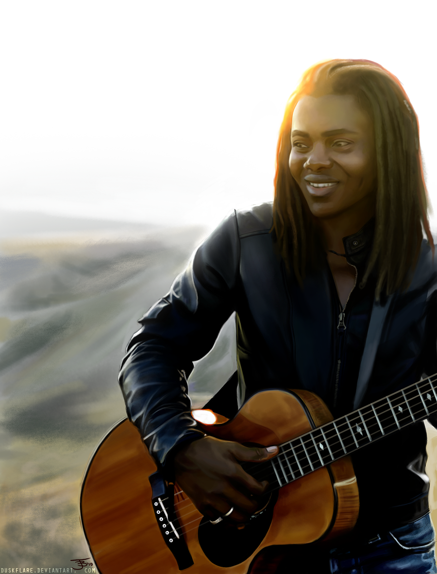
Tracy Chapman


Gabrielle Aplin
Female Artists:

Costume:
  • Girly - e.g. floaty dresses, light colours
  • Vintage
  • Often 'hippie' style - e.g. headbands, flower wreaths
  • Long hair
  • Individual, unique style - don't follow trends
Props:
  • Usually play an instrument - popularly piano or acoustic guitar.
Gabrielle Aplin
Poses:
  • Comfortable poses (look natural, whilst still looking posed).
  • Can be similar to editorial modelling shoots.
  • Don't smile, but not in an angsty way.
  • If smile is used, this portrays their casual nature. The smile must be natural, not forced. 
  • On location (often in nature)

Birdy

Bands:
Arctic Monkeys
  • Male dominated - exclusively female bands are very rare. Generally all male members or predominantly male with one girl. 
  • One of the only genres where duos work. Bands in other genres rarely include only 2 members. 
  • Most if not all members play instruments. 
  • Members have a uniqueness about them - don't follow trends. 
Of Monsters & Men
The White Stripes
Snow Patrol

Overall Representation & Attitudes:
  • They care more about the music than the fame (sometimes shown to dislike the fame). 
  • Write their own music.
  • Neither gender sexualised - genre appeals to both men and women (fan base not dominated by either gender). 
  • Though the indie genre can be associated with individualists, its increasing popularity has brought it into the mainstream. 
  • The message supported by the genre tends to be "it's cool to be different". 
  • Focus is heavily on the music. However, as indie music is becoming increasingly popular with mainstreamers, mimicking their style has become important and has contributed to the start of certain fashion trends (e.g. retro/vintage).

Thursday 31 October 2013

Audience

Institution

Codes & Conventions

The Front Cover

There are several things that you usually see on a front cover.

The Masthead:
  • This has a consistent look. In most cases, size and font stay the same, but the colour may vary (e.g. Mixmag, Vibe).
  • The image may cover part of the masthead if the brand is particularly recognizable - this would be likely if the magazine has released many issues, therefore is particularly established.
 
  • In cases where the colour stays the same, the masthead takes a similar form to a logo. This aids with the branding of the magazine but keeps the colour scheme fairly similar each week. This becomes the magazine's signature style and becomes recognizable to their audience.
 
     
The Cover Star
  • The cover star - Usually an image of the star in the feature article. Can be a band or artist. Relates to the genre and usually tells the reader a lot about the magazine's content. There are some exceptions to this rule (e.g. some NME covers). 
  

  • Sell lines - There are multiple sell lines placed around the main image, with one larger sell line which supports the cover star. 
  • Colour scheme - Tend to follow one of two rules: the same colour scheme is used each week (often related to the masthead) or the colour scheme changes from issue to issue. For example, Q follows a uniform colour scheme and Mixmag varies from cover to cover. 
     

  • Institutional information - barcode, price, date, issue number
  • Plug - Promotes the magazine through the audience winning something. This, for example, could be to win a chance to meet a band or artist. If the reader is a fan, they are more likely to pick up the magazine so that they can enter the competition, because they want to meet them. 

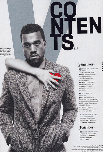
Contents Page
  • Note from the editor (with editor's image) - Both are not seen in every magazine, but it is seen as a convention of them. The content of the editor's note can vary, but they usually comment on the important content. 
  • Images - There are usually multiple images on a contents page. This usually depends on how busy or minimalistic it was intended to look. 
   

  • Subscription details - Often brings the reader's attention to a subscription deal. This tries to get the reader to be a regular reader of the magazine. As most readers will at some point read the contents page, it is the placement that has the most chance of getting readers to subscribe. 
  • Contents details - All the content of the magazine is set out on this page. There will be a page number, article heading and usually a little description, in smaller print, below. 
  • Headings - This isn't entirely necessary, but usually there are several headings that split up the content so that the reader can find what they want to read more easily. "Features" is a common heading. 
  • Plugs - Can also be seen on a contents page
Double Page Spread
  • Feature article - This is what the cover star was advertising. The main content of the magazine for that issue. This can be because the star is the most famous or because they are most in the public eye at the moment (e.g. releasing an album). 
  • Images - An article can span several double page spreads, and the first usually includes the least text. The first often contains a full bleed image, with following pages containing more smaller images.


Tuesday 22 October 2013

Survey


Create your free online surveys with SurveyMonkey , the world's leading questionnaire tool.

Monday 21 October 2013

Analysis of Double Page Spreads


Production Log - 21st Oct: Cover Star

I am considering using her as the female member of my indie band. My idea is to have a band of four - with one girl. I have noticed that indie bands are male dominant (either all or mostly men). For example, bands Arctic Monkeys and Kings of Leon are solely male and the band Of Monsters and Men has five male members and one female.

Sunday 20 October 2013

Production Log - 20th Oct: Choosing A Magazine Name

This week in lessons I decided on a final name for my magazine. This was Live, with the tagline "We live sound. We live music."


 I designed a masthead for the magazine, using a distressed font called "Broken Detroit". I think the masthead looks strong and may come to be the final one that I use on my magazine (although I think I will try others out to make sure this is the best my masthead could look). 

Outside of lesson, I have been researching double page spreads. As I aim to put an indie band on my front cover, I looked at an article from NME about the Arctic Monkeys. 

Tuesday 15 October 2013

Magazine Name Ideas

  • PopArt
  • Acoustic
  • ListenUp
  • Hear This
  • Mono
  • Cover
  • Live - We Live Sound. We Live Music.
  • ArtMusic - Music is Art
  • M.I.A - Music is Art
  • Lyrical
  • IndieVisual
  • The Alternative
  • Songbird


There were several name ideas that were fairly easy to eliminate. The obviously music related words (e.g. "Lyrical" and "Acoustic") are too literal for magazine names. Therefore I got rid of them.

  • Acoustic
  • Mono
  • Cover
  • Lyrical

  • Another name I decided did not work was "Listen Up", because I thought the name sounded more like it was related to urban/pop music.

    With the remaining names, I created a 'moodboard' style page of names on photoshop, to see which of them visually looked good as a magazine name.


    There were certain names which I felt instantly did not work.
    • hearTHIS
    • ARTmusic
    • MIA
    • PopArt
    • Songbird
    The first name "hearTHIS" didn't work, because it didn't visually look like a magazine name (it was more likely to look like a sell line). Also, I found that, as it didn't look right, it didn't stand out amongst the other names.
    "ARTmusic" didn't work for me, because I don't think it was as clear who my target audience was.
    Although I liked the name "PopArt" and its play on words, the mention of the word 'pop' would suggest that my magazine is in that genre, and therefore would attract the wrong target audience.
    "MIA" also felt wrong because (as with ARTmusic) my target audience was unclear. Also, I think it is too closely associated to 'missing in action' to ever be related to the magazine.
    Lastly, the name "Songbird" was instantly a no for me because it seemed like it would too directly target a female audience, and this would alienate a huge part of my potential audience. Also, music magazines are more popular with men. Therefore I feel it is important to target them with my magazine.

    I was then left with 3 names:
    • IndieVisual
    • The Alternative
    • Live - We Live Sound. We Live Music.
    I ruled out "The Alternative" as I felt it sounded to much like a newspaper and therefore too formal.

    Out of the two remaining names I decided to use "IndieVisual".

    I decided to use the name "IndieVisual" because I thought it was an interesting play on words. Also, the name is short enough for people to remember easily, without being too short that the name isn't distinct enough. The name flows well and therefore is more marketable.
    In terms of the name's connotations, I feel "IndieVisual" sums up everything the magazine should be about. It clearly displays the genre whilst also suggesting that the magazine is a visual extension of the music the readers like.

    Sunday 13 October 2013

    Production Log - 13th Oct - Cover Star Ideas

    I have decided that my front cover will feature an indie style band, consisting of 3 guys and a girl.


    I spotted a hat, which I think captures the indie style well. I would put this type of hat on my female model along with bohemian/vintage style clothing. 

    Ideas:
    (Dress)
    (Kimono)

    Production Log - 13th Oct: Genre, Research & Next Steps

    During lessons in media I have been working on planning my magazine.
    Firstly, I decided that the genre of my magazine will be Indie Rock Pop (which I have been focusing my research on).

    I started on my mood board, because I felt that would help me work out the vibe my magazine would have. Also, it helped me to organize the ideas I had in my head, so I could work with them in the rest of my planning. From this, I realized that the indie genre is very visual (with interesting styling - clothing is important in this genre - and artistic album covers). Again, with rock pop, there is a visual element (e.g. Lady Gaga). This means I need to make sure my magazine is visually interesting to not only capture the audience, but the feel of the genre.

    My next step has been to come up with some name ideas, which I will complete next week and decide on which name I will work with.

    Outside of lessons, I have been conducting research into existing magazines. This began with research into three front covers and I am continuing with research into contents pages.
    I have also been thinking about what my cover star will be like and what sort of styling they will have.

    Monday 30 September 2013

    Production Log - Preliminary Task

    The preliminary task was completed in two weeks, and was to create a front cover and contents page for a school magazine.
    In our first lesson, we were shown examples of previous students' work. This gave me an idea of what I needed to create and I started to get some ideas. 
    Following this, we went out around the school to take pictures with a DSLR. It was important to think of what could be used as a cover photo (so a combination of portrait and landscape shots were taken).

    Our next step was to produce some design sketches. By this point I had some idea of which picture I wanted to use as my cover photo. Before sketching I decided on a name for the magazine "News@Haydon". I thought the name would be effective for the target audience, as the '@' symbol suggests some form of online interactivity. 
    The design sketches gave me a better idea of the layout my magazine was going to have for when I went on to create the final product in Adobe InDesign - an industry standard piece of software.

    Once I was happy with my front cover and contents page, I exported them as JPEGs so that I was able to post them onto my blog. 

    Sunday 22 September 2013

    Preliminary Task

    Front Cover


    For the front cover, I chose a colour scheme that coordinated with the picture to give the cover a more unified look. The font 'Century Gothic' is used throughout, with some words in bold and/or capitals for effect. This gives the magazine its house style. In other issues of this magazine, I would change the colour scheme to coordinate with the picture. This keeps it interesting for the readers. I called this issue the 'Back to School Edition' to give it relevance to the date (September issue would be the first in the school year). The sell lines are stereotypically related to school life, whilst the most important sell line "The New Building", keeps it relevant to Haydon (because of the building works taking place). 
    The name of the magazine "News@Haydon" gives the magazine an up-to-date, modern edge (the '@' symbol is used frequently on social networking sites such as Twitter). This targets the right age group for the magazine. It also suggests interactivity with the magazine (this is a feature that could be added in the future). To support this, I have used the sell line 'the best ways to learn online'. 


    Contents Page

    The contents page contributes to the overall house style I have created. The font matches that on the front cover and using the '@' symbol in the word 'Contents' makes the house style unique. I feel the content of the magazine fits perfectly with the purpose and target audience. Having a large picture relating to the cover story encourages readers to keep reading.