Thursday 31 October 2013
Codes & Conventions
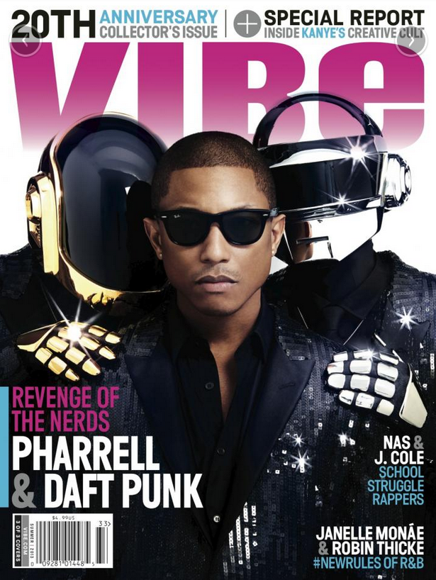
The Front Cover
There are several things that you usually see on a front cover.
The Masthead:
The Masthead:
- This has a consistent look. In most cases, size and font stay the same, but the colour may vary (e.g. Mixmag, Vibe).
- The image may cover part of the masthead if the brand is particularly recognizable - this would be likely if the magazine has released many issues, therefore is particularly established.

- In cases where the colour stays the same, the masthead takes a similar form to a logo. This aids with the branding of the magazine but keeps the colour scheme fairly similar each week. This becomes the magazine's signature style and becomes recognizable to their audience.
- The cover star - Usually an image of the star in the feature article. Can be a band or artist. Relates to the genre and usually tells the reader a lot about the magazine's content. There are some exceptions to this rule (e.g. some NME covers).


- Sell lines - There are multiple sell lines placed around the main image, with one larger sell line which supports the cover star.
- Colour scheme - Tend to follow one of two rules: the same colour scheme is used each week (often related to the masthead) or the colour scheme changes from issue to issue. For example, Q follows a uniform colour scheme and Mixmag varies from cover to cover.


- Institutional information - barcode, price, date, issue number
- Plug - Promotes the magazine through the audience winning something. This, for example, could be to win a chance to meet a band or artist. If the reader is a fan, they are more likely to pick up the magazine so that they can enter the competition, because they want to meet them.
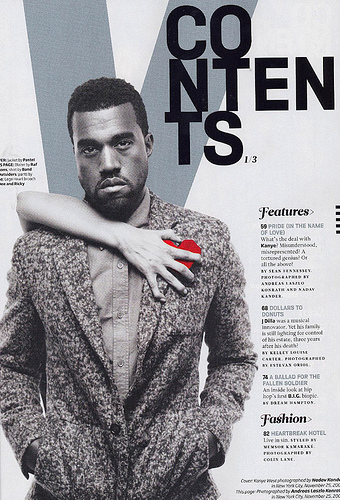
Contents Page
- Note from the editor (with editor's image) - Both are not seen in every magazine, but it is seen as a convention of them. The content of the editor's note can vary, but they usually comment on the important content.
- Images - There are usually multiple images on a contents page. This usually depends on how busy or minimalistic it was intended to look.


- Subscription details - Often brings the reader's attention to a subscription deal. This tries to get the reader to be a regular reader of the magazine. As most readers will at some point read the contents page, it is the placement that has the most chance of getting readers to subscribe.
- Contents details - All the content of the magazine is set out on this page. There will be a page number, article heading and usually a little description, in smaller print, below.
- Headings - This isn't entirely necessary, but usually there are several headings that split up the content so that the reader can find what they want to read more easily. "Features" is a common heading.
- Plugs - Can also be seen on a contents page
Double Page Spread
- Feature article - This is what the cover star was advertising. The main content of the magazine for that issue. This can be because the star is the most famous or because they are most in the public eye at the moment (e.g. releasing an album).
- Images - An article can span several double page spreads, and the first usually includes the least text. The first often contains a full bleed image, with following pages containing more smaller images.
Wednesday 30 October 2013
Tuesday 22 October 2013
Monday 21 October 2013
Production Log - 21st Oct: Cover Star

Sunday 20 October 2013
Production Log - 20th Oct: Choosing A Magazine Name
This week in lessons I decided on a final name for my magazine. This was Live, with the tagline "We live sound. We live music."

I designed a masthead for the magazine, using a distressed font called "Broken Detroit". I think the masthead looks strong and may come to be the final one that I use on my magazine (although I think I will try others out to make sure this is the best my masthead could look).
Outside of lesson, I have been researching double page spreads. As I aim to put an indie band on my front cover, I looked at an article from NME about the Arctic Monkeys.
Tuesday 15 October 2013
Magazine Name Ideas
- PopArt
- Acoustic
- ListenUp
- Hear This
- Mono
- Cover
- Live - We Live Sound. We Live Music.
- ArtMusic - Music is Art
- M.I.A - Music is Art
- Lyrical
- IndieVisual
- The Alternative
- Songbird
There were several name ideas that were fairly easy to eliminate. The obviously music related words (e.g. "Lyrical" and "Acoustic") are too literal for magazine names. Therefore I got rid of them.
Another name I decided did not work was "Listen Up", because I thought the name sounded more like it was related to urban/pop music.
With the remaining names, I created a 'moodboard' style page of names on photoshop, to see which of them visually looked good as a magazine name.

There were certain names which I felt instantly did not work.
- hearTHIS
- ARTmusic
- MIA
- PopArt
- Songbird
"ARTmusic" didn't work for me, because I don't think it was as clear who my target audience was.
Although I liked the name "PopArt" and its play on words, the mention of the word 'pop' would suggest that my magazine is in that genre, and therefore would attract the wrong target audience.
"MIA" also felt wrong because (as with ARTmusic) my target audience was unclear. Also, I think it is too closely associated to 'missing in action' to ever be related to the magazine.
Lastly, the name "Songbird" was instantly a no for me because it seemed like it would too directly target a female audience, and this would alienate a huge part of my potential audience. Also, music magazines are more popular with men. Therefore I feel it is important to target them with my magazine.
I was then left with 3 names:
- IndieVisual
- The Alternative
- Live - We Live Sound. We Live Music.
Out of the two remaining names I decided to use "IndieVisual".
I decided to use the name "IndieVisual" because I thought it was an interesting play on words. Also, the name is short enough for people to remember easily, without being too short that the name isn't distinct enough. The name flows well and therefore is more marketable.
In terms of the name's connotations, I feel "IndieVisual" sums up everything the magazine should be about. It clearly displays the genre whilst also suggesting that the magazine is a visual extension of the music the readers like.
Monday 14 October 2013
Sunday 13 October 2013
Production Log - 13th Oct - Cover Star Ideas
I have decided that my front cover will feature an indie style band, consisting of 3 guys and a girl.

I spotted a hat, which I think captures the indie style well. I would put this type of hat on my female model along with bohemian/vintage style clothing.
Ideas:
 |
| (Dress) |
 |
| (Kimono) |
Production Log - 13th Oct: Genre, Research & Next Steps
During lessons in media I have been working on planning my magazine.
Firstly, I decided that the genre of my magazine will be Indie Rock Pop (which I have been focusing my research on).
I started on my mood board, because I felt that would help me work out the vibe my magazine would have. Also, it helped me to organize the ideas I had in my head, so I could work with them in the rest of my planning. From this, I realized that the indie genre is very visual (with interesting styling - clothing is important in this genre - and artistic album covers). Again, with rock pop, there is a visual element (e.g. Lady Gaga). This means I need to make sure my magazine is visually interesting to not only capture the audience, but the feel of the genre.
My next step has been to come up with some name ideas, which I will complete next week and decide on which name I will work with.
Outside of lessons, I have been conducting research into existing magazines. This began with research into three front covers and I am continuing with research into contents pages.
I have also been thinking about what my cover star will be like and what sort of styling they will have.
Monday 7 October 2013
Subscribe to:
Posts (Atom)